Top traders, investors and technical analysts use different types of price charts to display historical and real time price data of financial markets from stocks, commodities, indexes, bonds, futures, options and currencies.
The type of chart used very much depends on an individuals preferences.
The 4 main types of price charts used in technical analysis are:
- Candlestick Charts
- Bar Charts
- Line Charts
- Point And Figure Charts
These are by far the most popular types of charts used as they offer the most clarity and are easy to interpret and understand.
1. Candlestick Charts
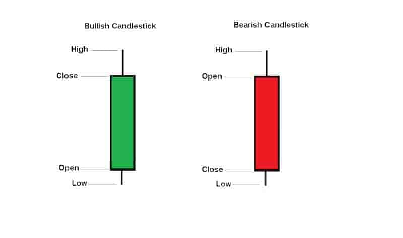
Candlestick charts are price charts that display the open price, high price, low price and closing price over a specific time set out by the trader in the form of a rectangle block with wicks on the top and bottom of the block.
The rectangle block of the candlestick chart is also known as the candlestick body. A body is green when the price movement is bullish and has closed higher than it opened.
A body is red when the price movement is bearish and has closed at a price lower than it opened.
Candlestick price charts make it easy for a trader or investor to analyze the emotions of traders and the crowd in a market.
Traders and investors also find candlestick patterns to help offer buying and shorting signals in a financial market.
These candlestick patterns can only be found on candlestick price charts.
Example Of Candlesticks

The above image is an example of a bullish candlestick and a bearish candlestick.
Candlesticks charts are some of the easiest price charts to read. Many new traders and investors learn them relatively fast.
2. Bar Charts
Bar charts display the same information as a candlestick chart except they are different visually. A bar chart displays an open price, high price, low price and closing price.
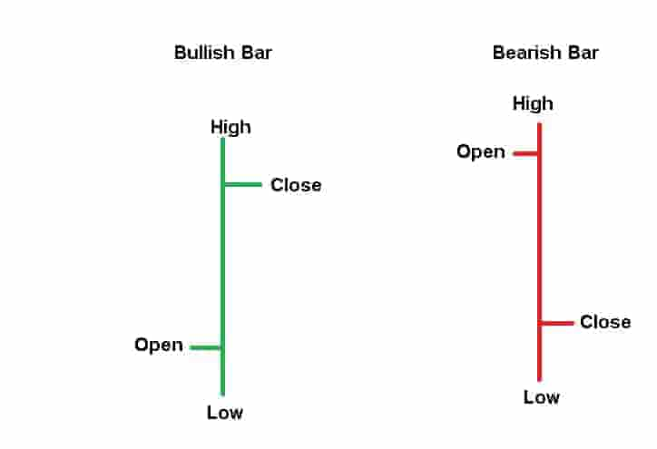
A bar chart displays this information in the form of a vertical line with 2 horizontal lines for the opening price level and the closing price level.
Bar Chart Example

The bar chart example shows a bullish bar chart and a bearish bar chart. The bullish bar chart is green when the price closes higher than it opened.
The bearish bar chart is red when the price closes lower than it opened.
The top of the bar represents the highest price during the specified timeframe and the bottom of the bar represents the lowest price during the specified timeframe.
For example, a daily bar chart of the S&P500 will show the opening price, high price, low price and closing price for the S&P500 over the day.
The bar chart displays the same information as a candlestick chart except the bar chart does not have a rectangle body.
3. Line Charts
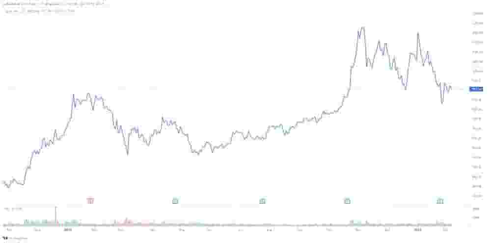
A line chart is a chart that displays the historical price data of a financial market in the form of a line.
A line chart is constructed using the closing prices of a market over a specific timeframe, typically a daily timeframe.
These closing prices are joined together to form the line chart. Line charts can also be constructed using opening prices, high prices or low prices but the most popular and widely used is the closing prices
A line chart displays less information than candlesticks or bar charts.
For example, a closing price line chart does not show the high price or low price or opening price information on a chart.
Example Of A Line Chart

In the above bar chart example, the blue line plots the closing price of Tesla every day and joins them together using lines.
Some traders prefer using line charts because they believe it removes much of the noise in the financial markets caused by occasional extreme volatility.
4. Point And Figure Charts
A point and figure chart displays the volatility in the price of a financial market. It is a study of pure price movement and does not take time into account consideration like other price chart types.
Point and figure charts are the most distinctly different type of price chart used in technical analysis as it looks nothing like the other price chart types listed.
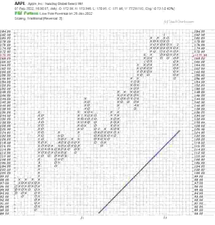
The point and figure charts are displayed as X’s and O’s in a box style. Only the price changes are recorded on a point and figure chart.
The ‘x’ columns indicate the price is increasing and the ‘o’ columns indicate that price is decreasing.
The box size of the x’s and o’s is determined by a trader. For example, a box size might only show price increases or decreases of $5 increments.
In this case, if price moves up $3, a new x box would not be drawn. However, if price moved up $6, a new x would be drawn on the chart.
During active and volatile markets, there can be a large amount of plotting of x’s and o’s whereas during the quieter and less volatile times in the market, there will be less plotting of x’s and o’s.
The box size can also play a role in how many x’s and o’s are charted onto a point and figure chart.
With point and figure charts, if no price change occurs, the point and figure chart will remain unchanged.
Example Of A Point And Figure Chart

The above image is a point and figure chart of Apple stock price. Visually, this is substantially different from other types of price charts.
Point and figure charts are favored by some traders and investors because they make it easy to spot support and resistance levels in financial markets.
They can also help a trader spot breakouts with more precision.
Conclusion
The four price chart types of line charts, bar charts, candlestick charts and point and figure charts are the most commonly used charts for doing technical analysis and analyzing the historical price data of various financial markets.
These price charts make it easy to use technical indicators, chart patterns and candlestick patterns to help with finding buying and shorting signals of a market.
This is why they are used so frequently in technical analysis.
